

The low optical centre and wide horizontal crossbars are Avory's key design features.
The low optical centre and wide horizontal crossbars are Avory's key design features.
The low optical centre and wide horizontal crossbars are Avory's key design features.
The low optical centre and wide horizontal crossbars are Avory's key design features.
The low optical centre and wide horizontal crossbars are Avory's key design features.
Published: Rosetta Type Foundry in 2017
Published: Rosetta Type Foundry in 2017
Published: Rosetta Type Foundry in 2017
Published: Rosetta Type Foundry in 2017
Published: Rosetta Type Foundry in 2017
Language support: Latin (119+ languages), Cyrillic (39+ languages), Greek (1 language)
Language support: Latin (119+ languages), Cyrillic (39+ languages), Greek (1 language)
Language support: Latin (119+ languages), Cyrillic (39+ languages), Greek (1 language)
Language support: Latin (119+ languages), Cyrillic (39+ languages), Greek (1 language)
Language support: Latin (119+ languages), Cyrillic (39+ languages), Greek (1 language)
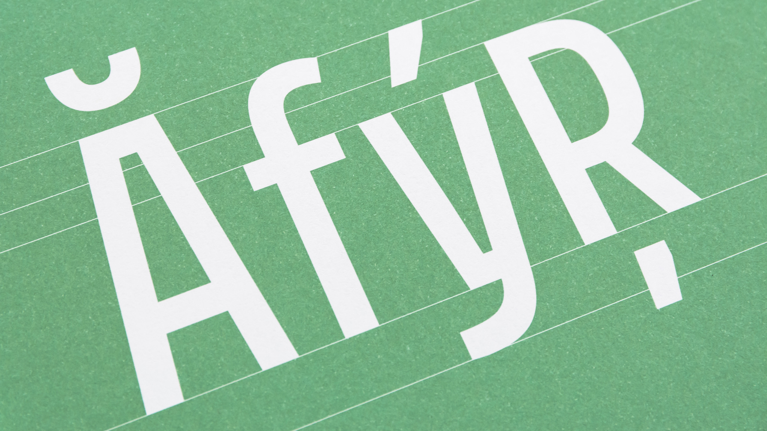
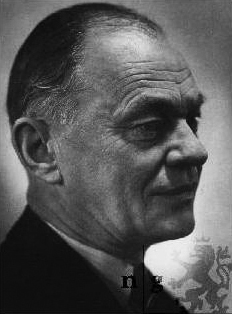
Avory is a gently condensed sans that challenges convention. It finds itself on the expressive end of the spectrum – features like the low optical center and wide horizontal crossbars give it an unmistakable appearance. Tall, with broad shoulders, easily spotted from afar. Inspired by the lettering work of Czech designer Jaroslav Benda, a lesser known treasure of mid-century graphic design. From there it developed into a full-fledged typographic power tool. Nine weights, complete with italics, small caps, a wide range of symbols, and additional support for Greek and Cyrillic scripts. Available in two versions that work like a different outfit.
Avory is a gently condensed sans that challenges convention. It finds itself on the expressive end of the spectrum – features like the low optical center and wide horizontal crossbars give it an unmistakable appearance. Tall, with broad shoulders, easily spotted from afar. Inspired by the lettering work of Czech designer Jaroslav Benda, a lesser known treasure of mid-century graphic design. From there it developed into a full-fledged typographic power tool. Nine weights, complete with italics, small caps, a wide range of symbols, and additional support for Greek and Cyrillic scripts. Available in two versions that work like a different outfit.
Avory is a gently condensed sans that challenges convention. It finds itself on the expressive end of the spectrum – features like the low optical center and wide horizontal crossbars give it an unmistakable appearance. Tall, with broad shoulders, easily spotted from afar. Inspired by the lettering work of Czech designer Jaroslav Benda, a lesser known treasure of mid-century graphic design. From there it developed into a full-fledged typographic power tool. Nine weights, complete with italics, small caps, a wide range of symbols, and additional support for Greek and Cyrillic scripts. Available in two versions that work like a different outfit.
Avory is a gently condensed sans that challenges convention. It finds itself on the expressive end of the spectrum – features like the low optical center and wide horizontal crossbars give it an unmistakable appearance. Tall, with broad shoulders, easily spotted from afar. Inspired by the lettering work of Czech designer Jaroslav Benda, a lesser known treasure of mid-century graphic design. From there it developed into a full-fledged typographic power tool. Nine weights, complete with italics, small caps, a wide range of symbols, and additional support for Greek and Cyrillic scripts. Available in two versions that work like a different outfit.
Avory is a gently condensed sans that challenges convention. It finds itself on the expressive end of the spectrum – features like the low optical center and wide horizontal crossbars give it an unmistakable appearance. Tall, with broad shoulders, easily spotted from afar. Inspired by the lettering work of Czech designer Jaroslav Benda, a lesser known treasure of mid-century graphic design. From there it developed into a full-fledged typographic power tool. Nine weights, complete with italics, small caps, a wide range of symbols, and additional support for Greek and Cyrillic scripts. Available in two versions that work like a different outfit.
AWARDS | EXHIBITIONS | PUBLICATIONS | MENTIONS:
AWARDS | EXHIBITIONS | PUBLICATIONS | MENTIONS:
AWARDS | EXHIBITIONS | PUBLICATIONS | MENTIONS:
AWARDS | EXHIBITIONS | PUBLICATIONS | MENTIONS:
AWARDS | EXHIBITIONS | PUBLICATIONS | MENTIONS:
- Typographica's favorite typefaces of 2017 – splendid review written by Yves Peters
- ED Awards 2018 – Avory won Silver medal at European Design Awards
- Typefaces with perfect Cyrillic 2017 – type.today's and Typejournal.ru's selection
- Fonts SK – Part of the publication which maps digital type design in Slovakia
- NCD 2018 – Part of the publication and exhibition of Slovak Design Award
- Tokyo TDC 2018 – Part of the annual book
- Czech and Slovak design exhibition in Taiwan
- Typographica's favorite typefaces of 2017 – splendid review written by Yves Peters
- ED Awards 2018 – Avory won Silver medal at European Design Awards
- Typefaces with perfect Cyrillic 2017 – type.today's and Typejournal.ru's selection
- Fonts SK – Part of the publication which maps digital type design in Slovakia
- NCD 2018 – Part of the publication and exhibition of Slovak Design Award
- Tokyo TDC 2018 – Part of the annual book
- Czech and Slovak design exhibition in Taiwan
- Typographica's favorite typefaces of 2017 – splendid review written by Yves Peters
- ED Awards 2018 – Avory won Silver medal at European Design Awards
- Typefaces with perfect Cyrillic 2017 – type.today's and Typejournal.ru's selection
- Fonts SK – Part of the publication which maps digital type design in Slovakia
- NCD 2018 – Part of the publication and exhibition of Slovak Design Award
- Tokyo TDC 2018 – Part of the annual book
- Czech and Slovak design exhibition in Taiwan
- Typographica's favorite typefaces of 2017 – splendid review written by Yves Peters
- ED Awards 2018 – Avory won Silver medal at European Design Awards
- Typefaces with perfect Cyrillic 2017 – type.today's and Typejournal.ru's selection
- Fonts SK – Part of the publication which maps digital type design in Slovakia
- NCD 2018 – Part of the publication and exhibition of Slovak Design Award
- Tokyo TDC 2018 – Part of the annual book
- Czech and Slovak design exhibition in Taiwan
- Typographica's favorite typefaces of 2017 – splendid review written by Yves Peters
- ED Awards 2018 – Avory won Silver medal at European Design Awards
- Typefaces with perfect Cyrillic 2017 – type.today's and Typejournal.ru's selection
- Fonts SK – Part of the publication which maps digital type design in Slovakia
- NCD 2018 – Part of the publication and exhibition of Slovak Design Award
- Tokyo TDC 2018 – Part of the annual book
- Czech and Slovak design exhibition in Taiwan
CREDITS
CREDITS
CREDITS
CREDITS
CREDITS
Post-production: David Březina
Post-production: David Březina
Post-production: David Březina
Post-production: David Březina
Post-production: David Březina
Consultancy: Maria Doreuli (Cyrillic), Irene Vlachou (Greek)
Consultancy: Maria Doreuli (Cyrillic), Irene Vlachou (Greek)
Consultancy: Maria Doreuli (Cyrillic), Irene Vlachou (Greek)
Consultancy: Maria Doreuli (Cyrillic), Irene Vlachou (Greek)
Consultancy: Maria Doreuli (Cyrillic), Irene Vlachou (Greek)
Promo materials: Anna Giedryś, Kamil Kurzajewski
Promo materials: Anna Giedryś, Kamil Kurzajewski
Promo materials: Anna Giedryś, Kamil Kurzajewski
Promo materials: Anna Giedryś, Kamil Kurzajewski
Promo materials: Anna Giedryś, Kamil Kurzajewski
© 2018 by Sláva Jevčinová
© 2018 by Sláva Jevčinová
© 2018 by Sláva Jevčinová
© 2018 by Sláva Jevčinová