

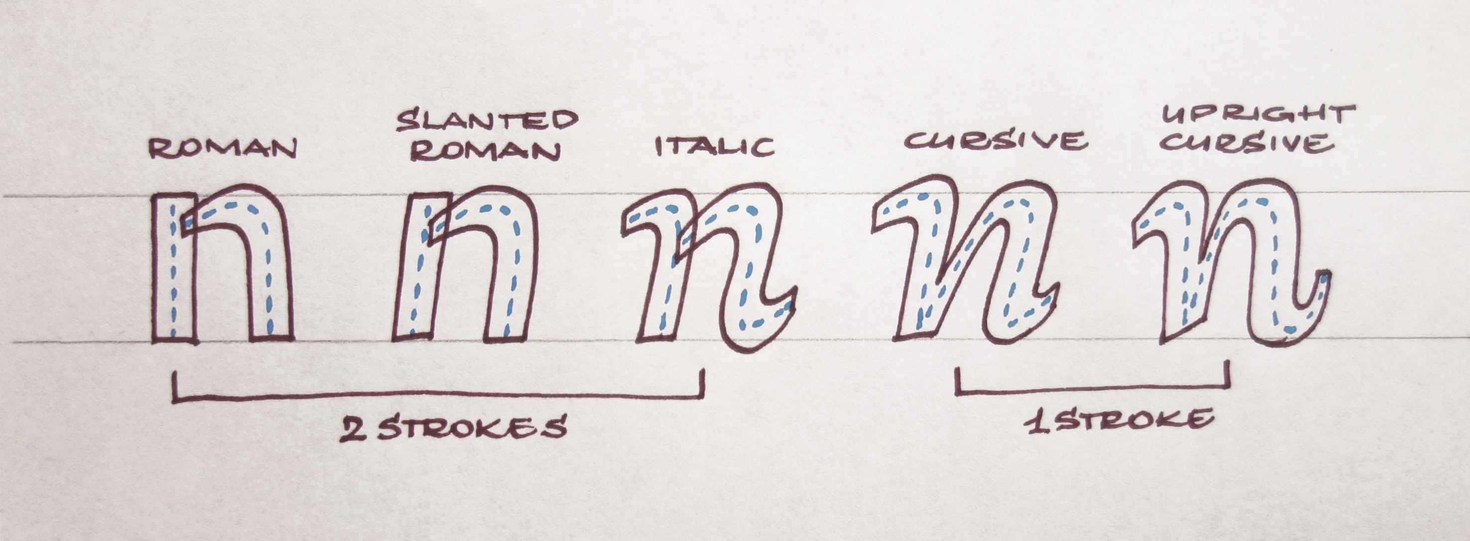
The main difference between roman and italic is not the slant, but the construction.
The main difference between roman and italic is not the slant, but the construction.
The main difference between roman and italic is not the slant, but the construction.
The main difference between roman and italic is not the slant, but the construction.
The main difference between roman and italic is not the slant, but the construction.
- Final Master degree project: Ambi (before called Duplex)
- University: J.E.Purkyně University in Ústí nad Labem Faculty of Art and Design | Studio Graphic Design II.
- Head of Studio: Michal Slejška
- Studio Assistant: Pavel Frič
- Consultancy: David Březina
- Assignment: Design a new type family system
- Language support: Latin
- Year: 2013
- Final Master degree project: Ambi (before called Duplex)
- University: J.E.Purkyně University in Ústí nad Labem Faculty of Art and Design | Studio Graphic Design II.
- Head of Studio: Michal Slejška
- Studio Assistant: Pavel Frič
- Consultancy: David Březina
- Assignment: Design a new type family system
- Language support: Latin
- Year: 2013
- Final Master degree project: Ambi (before called Duplex)
- University: J.E.Purkyně University in Ústí nad Labem Faculty of Art and Design | Studio Graphic Design II.
- Head of Studio: Michal Slejška
- Studio Assistant: Pavel Frič
- Consultancy: David Březina
- Assignment: Design a new type family system
- Language support: Latin
- Year: 2013
- Final Master degree project: Ambi (before called Duplex)
- University: J.E.Purkyně University in Ústí nad Labem Faculty of Art and Design | Studio Graphic Design II.
- Head of Studio: Michal Slejška
- Studio Assistant: Pavel Frič
- Consultancy: David Březina
- Assignment: Design a new type family system
- Language support: Latin
- Year: 2013
- Final Master degree project: Ambi (before called Duplex)
- University: J.E.Purkyně University in Ústí nad Labem Faculty of Art and Design | Studio Graphic Design II.
- Head of Studio: Michal Slejška
- Studio Assistant: Pavel Frič
- Consultancy: David Březina
- Assignment: Design a new type family system
- Language support: Latin
- Year: 2013
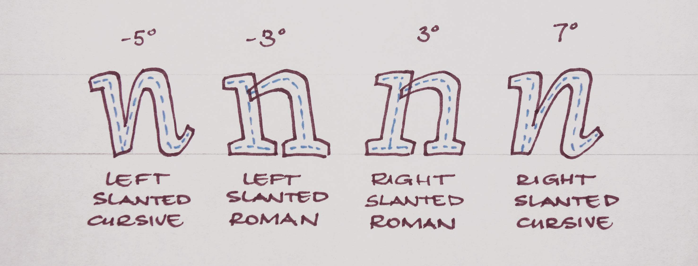
Ambi is a text serif type family designed just in 2 slants: left & right, including italic and bold weights. It is based on my own left-slanted handwriting with very generous x-heigh, intended for small sizes with application in periodicals. (books, magazines, catalogs etc.) Ambi contains eight weights altogether: Left light, Left light italic, Right light, Right light italic, Left bold, Left bold italic, Right bold, Right bold italic. The main goal was to find out how people can perceive slanted body text and how it can impact readability.
Ambi is a text serif type family designed just in 2 slants: left & right, including italic and bold weights. It is based on my own left-slanted handwriting with very generous x-heigh, intended for small sizes with application in periodicals. (books, magazines, catalogs etc.) Ambi contains eight weights altogether: Left light, Left light italic, Right light, Right light italic, Left bold, Left bold italic, Right bold, Right bold italic. The main goal was to find out how people can perceive slanted body text and how it can impact readability.
Ambi is a text serif type family designed just in 2 slants: left & right, including italic and bold weights. It is based on my own left-slanted handwriting with very generous x-heigh, intended for small sizes with application in periodicals. (books, magazines, catalogs etc.) Ambi contains eight weights altogether: Left light, Left light italic, Right light, Right light italic, Left bold, Left bold italic, Right bold, Right bold italic. The main goal was to find out how people can perceive slanted body text and how it can impact readability.
Ambi is a text serif type family designed just in 2 slants: left & right, including italic and bold weights. It is based on my own left-slanted handwriting with very generous x-heigh, intended for small sizes with application in periodicals. (books, magazines, catalogs etc.) Ambi contains eight weights altogether: Left light, Left light italic, Right light, Right light italic, Left bold, Left bold italic, Right bold, Right bold italic. The main goal was to find out how people can perceive slanted body text and how it can impact readability.
Ambi is a text serif type family designed just in 2 slants: left & right, including italic and bold weights. It is based on my own left-slanted handwriting with very generous x-heigh, intended for small sizes with application in periodicals. (books, magazines, catalogs etc.) Ambi contains eight weights altogether: Left light, Left light italic, Right light, Right light italic, Left bold, Left bold italic, Right bold, Right bold italic. The main goal was to find out how people can perceive slanted body text and how it can impact readability.
Letter construction
Letter construction
Letter construction
Letter construction
Letter construction
Questioning:
Questioning:
Questioning:
Questioning:
Questioning:
- What could happen if we would substitute upright text by slanted one?
- What could happen if we would substitute upright text by slanted text to the left?
- Can be running text created just by a combination of slanted texts?
- Or is it necessary to use the upright form because of our eye's and brain's preference?
- Is it correct to consider the left slant as an inferior?
- What could happen if we would substitute upright text by slanted one?
- What could happen if we would substitute upright text by slanted text to the left?
- Can be running text created just by a combination of slanted texts?
- Or is it necessary to use the upright form because of our eye's and brain's preference?
- Is it correct to consider the left slant as an inferior?
- What could happen if we would substitute upright text by slanted one?
- What could happen if we would substitute upright text by slanted text to the left?
- Can be running text created just by a combination of slanted texts?
- Or is it necessary to use the upright form because of our eye's and brain's preference?
- Is it correct to consider the left slant as an inferior?
- What could happen if we would substitute upright text by slanted one?
- What could happen if we would substitute upright text by slanted text to the left?
- Can be running text created just by a combination of slanted texts?
- Or is it necessary to use the upright form because of our eye's and brain's preference?
- Is it correct to consider the left slant as an inferior?
- What could happen if we would substitute upright text by slanted one?
- What could happen if we would substitute upright text by slanted text to the left?
- Can be running text created just by a combination of slanted texts?
- Or is it necessary to use the upright form because of our eye's and brain's preference?
- Is it correct to consider the left slant as an inferior?
My family planning
My family planning
My family planning
My family planning
My family planning
Sources of history
Sources of history
Sources of history
Sources of history
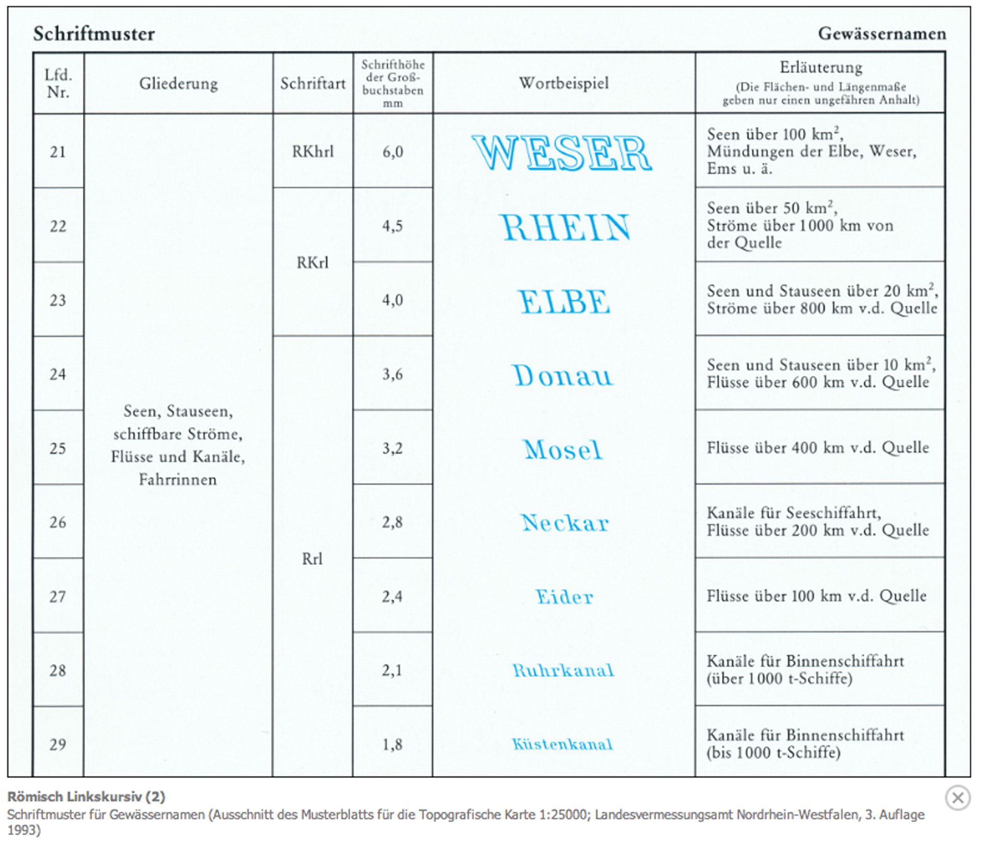
Part of my project was also history research of left slanted types. I was curious when it originated and in what kind of field. Of course left cursive doesn't have such an immense history as her right slanted sister, but in the end, I succeed to gather a nice collection. Especially interesting was the revelation that so-called Linkskursiv was specifically used in Cartography* mostly in Germany. Because maps were full of information they decided to distinguish all Hydronyms** by using left slanted type. I do present some of those sources.
Part of my project was also history research of left slanted types. I was curious when it originated and in what kind of field. Of course left cursive doesn't have such an immense history as her right slanted sister, but in the end, I succeed to gather a nice collection. Especially interesting was the revelation that so-called Linkskursiv was specifically used in Cartography* mostly in Germany. Because maps were full of information they decided to distinguish all Hydronyms** by using left slanted type. I do present some of those sources.
Part of my project was also history research of left slanted types. I was curious when it originated and in what kind of field. Of course left cursive doesn't have such an immense history as her right slanted sister, but in the end, I succeed to gather a nice collection. Especially interesting was the revelation that so-called Linkskursiv was specifically used in Cartography* mostly in Germany. Because maps were full of information they decided to distinguish all Hydronyms** by using left slanted type. I do present some of those sources.
Part of my project was also history research of left slanted types. I was curious when it originated and in what kind of field. Of course left cursive doesn't have such an immense history as her right slanted sister, but in the end, I succeed to gather a nice collection. Especially interesting was the revelation that so-called Linkskursiv was specifically used in Cartography* mostly in Germany. Because maps were full of information they decided to distinguish all Hydronyms** by using left slanted type. I do present some of those sources.
Part of my project was also history research of left slanted types. I was curious when it originated and in what kind of field. Of course left cursive doesn't have such an immense history as her right slanted sister, but in the end, I succeed to gather a nice collection. Especially interesting was the revelation that so-called Linkskursiv was specifically used in Cartography* mostly in Germany. Because maps were full of information they decided to distinguish all Hydronyms** by using left slanted type. I do present some of those sources.
*Cartography is the art and science of graphically representing a geographical area, usually on a flat surface such as a map or a chart, source
*Cartography is the art and science of graphically representing a geographical area, usually on a flat surface such as a map or a chart, source
*Cartography is the art and science of graphically representing a geographical area, usually on a flat surface such as a map or a chart, source
*Cartography is the art and science of graphically representing a geographical area, usually on a flat surface such as a map or a chart, source
**A hydronym is a proper name of a body of water. Hydronymy, a subset of toponymy, the taxonomic study of place-names, is the study of the names of bodies of water, the origins of those names, and how they are transmitted through history. Hydronyms may include the names of rivers, lakes, and even oceanic elements, source
**A hydronym is a proper name of a body of water. Hydronymy, a subset of toponymy, the taxonomic study of place-names, is the study of the names of bodies of water, the origins of those names, and how they are transmitted through history. Hydronyms may include the names of rivers, lakes, and even oceanic elements, source
**A hydronym is a proper name of a body of water. Hydronymy, a subset of toponymy, the taxonomic study of place-names, is the study of the names of bodies of water, the origins of those names, and how they are transmitted through history. Hydronyms may include the names of rivers, lakes, and even oceanic elements, source
**A hydronym is a proper name of a body of water. Hydronymy, a subset of toponymy, the taxonomic study of place-names, is the study of the names of bodies of water, the origins of those names, and how they are transmitted through history. Hydronyms may include the names of rivers, lakes, and even oceanic elements, source
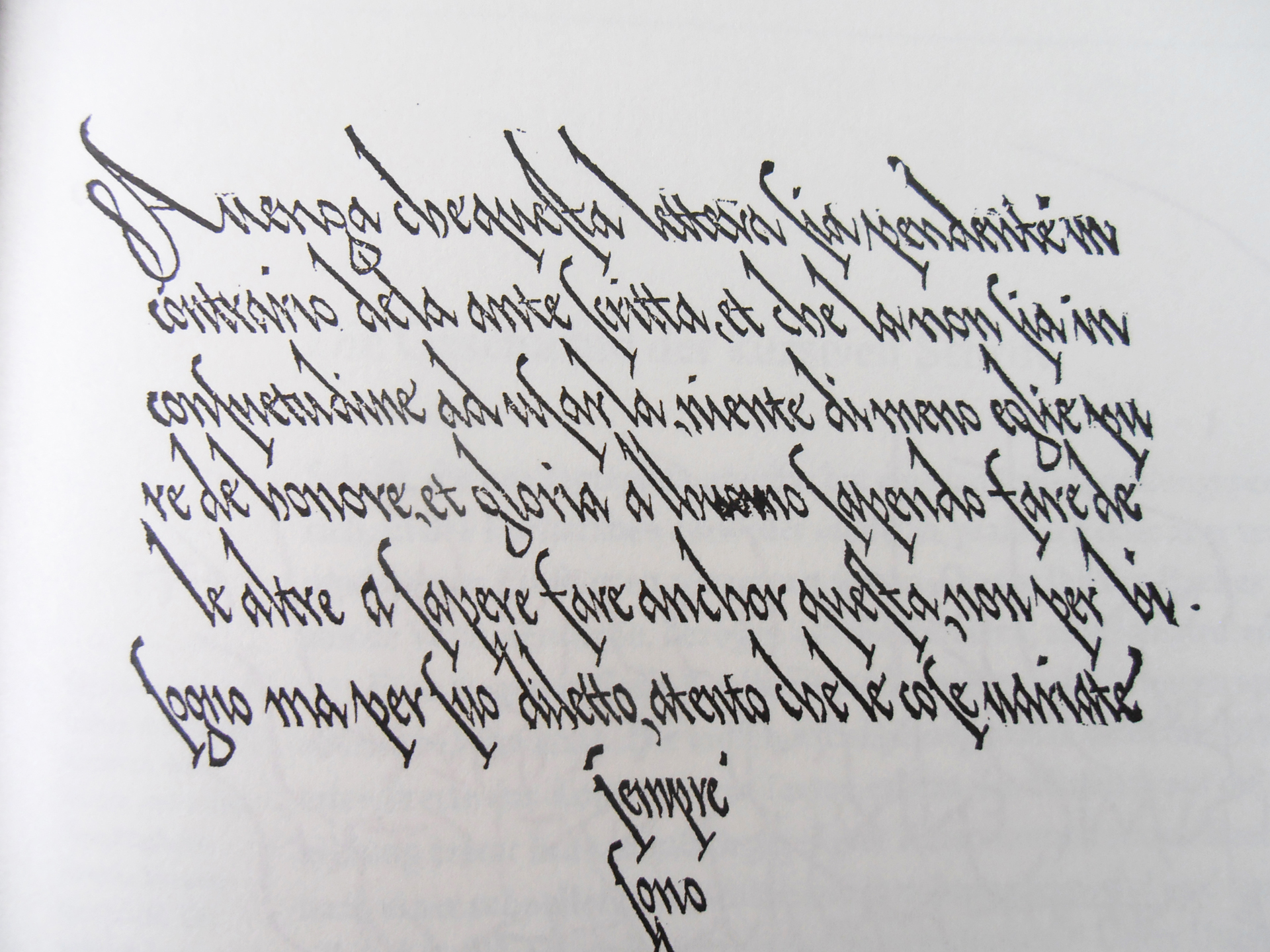
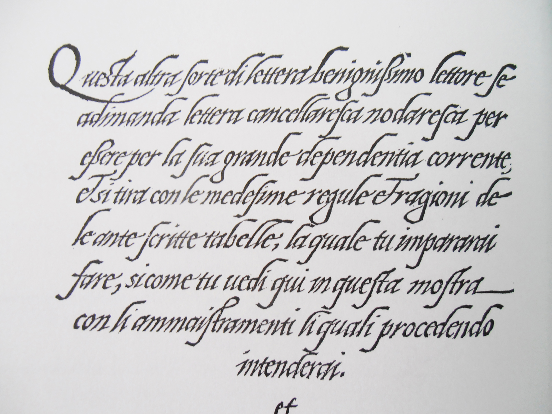
Giovanni Antonio Tagliente, manuscripts, around 1515, source
Giovanni Antonio Tagliente, manuscripts, around 1515, source
Giovanni Antonio Tagliente, manuscripts, around 1515, source
Giovanni Antonio Tagliente, manuscripts, around 1515, source
Giovanni Antonio Tagliente, manuscripts, around 1515, source
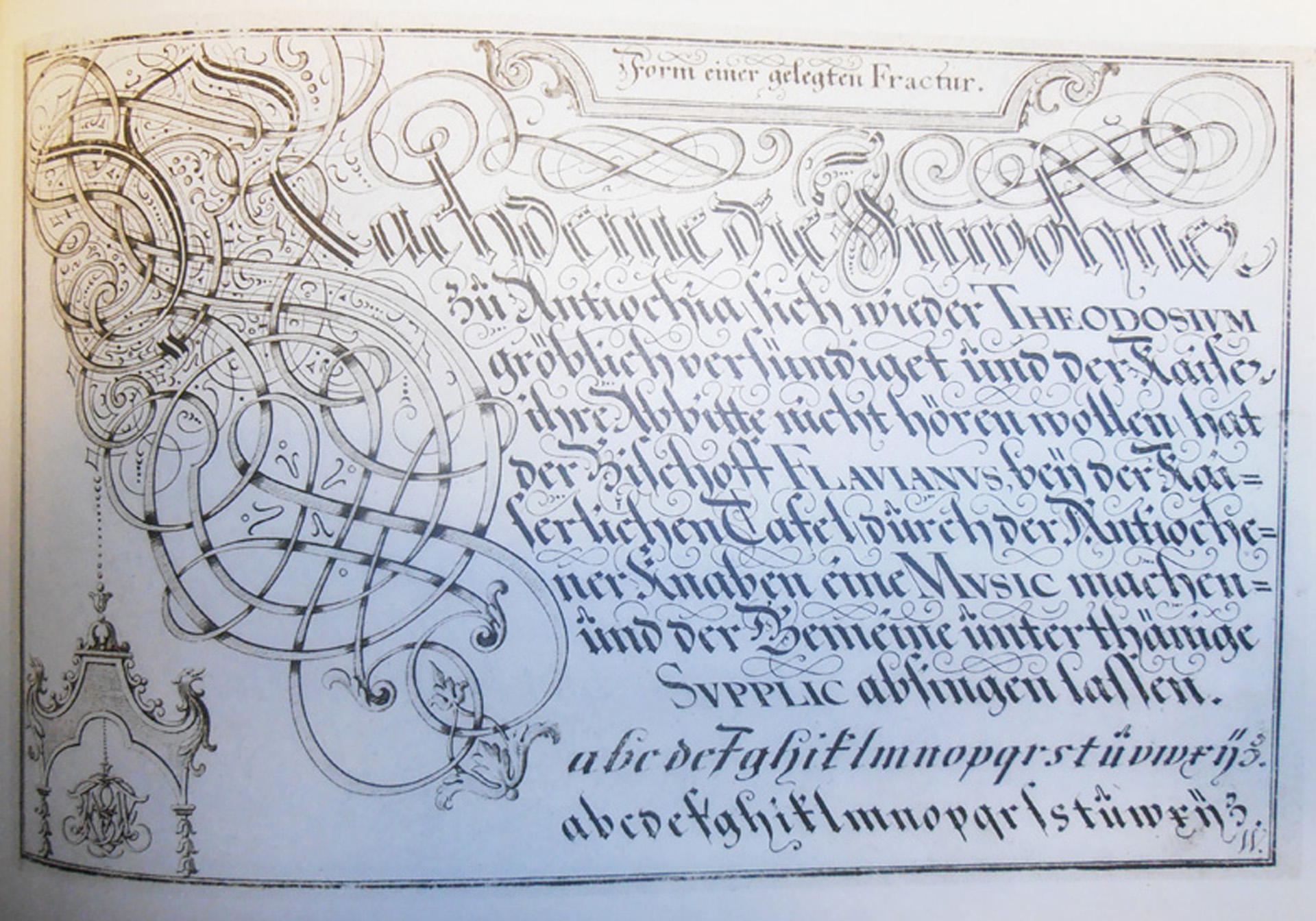
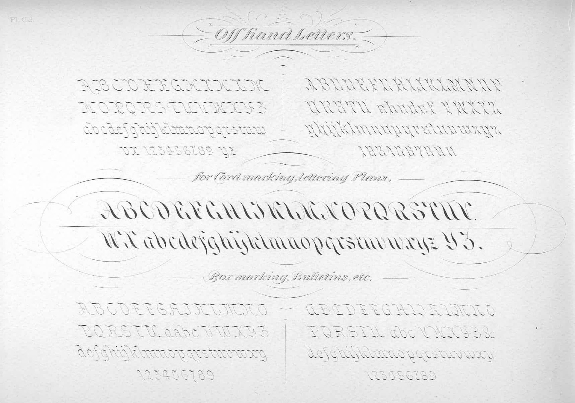
Michael Baurenfeind, manuscript, 1716
Michael Baurenfeind, manuscript, 1716
Michael Baurenfeind, manuscript, 1716
Michael Baurenfeind, manuscript, 1716
Michael Baurenfeind, manuscript, 1716
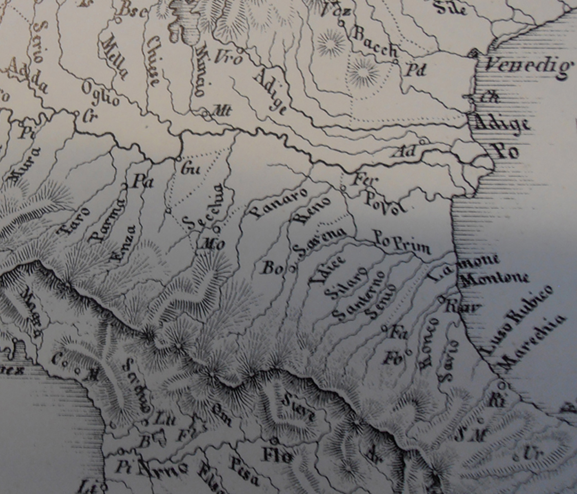
Map of Hydronyms in Germany, 1836
Map of Hydronyms in Germany, 1836
Map of Hydronyms in Germany, 1836
Map of Hydronyms in Germany, 1836
Map of Hydronyms in Germany, 1836
Categorization of the type based on the length of the river, Germany 1993
Categorization of the type based on the length of the river, Germany 1993
Categorization of the type based on the length of the river, Germany 1993
Categorization of the type based on the length of the river, Germany 1993
Categorization of the type based on the length of the river, Germany 1993
© 2018 by Sláva Jevčinová
© 2018 by Sláva Jevčinová
© 2018 by Sláva Jevčinová
© 2018 by Sláva Jevčinová